Developers
API References
Data Subject Request API
Data Subject Request API Version 1 and 2
Data Subject Request API Version 3
Platform API
Key Management
Platform API Overview
Accounts
Apps
Audiences
Calculated Attributes
Data Points
Feeds
Field Transformations
Services
Users
Workspaces
Warehouse Sync API
Warehouse Sync API Overview
Warehouse Sync API Tutorial
Warehouse Sync API Reference
Data Mapping
Warehouse Sync SQL Reference
Warehouse Sync Troubleshooting Guide
ComposeID
Warehouse Sync API v2 Migration
Audit Logs API
Bulk Profile Deletion API Reference
Calculated Attributes Seeding API
Data Planning API
Custom Access Roles API
Group Identity API Reference
Pixel Service
Profile API
Events API
mParticle JSON Schema Reference
IDSync
Client SDKs
AMP
AMP SDK
Android
Initialization
Configuration
Network Security Configuration
Event Tracking
User Attributes
IDSync
Screen Events
Commerce Events
Location Tracking
Media
Kits
Application State and Session Management
Data Privacy Controls
Error Tracking
Opt Out
Push Notifications
WebView Integration
Logger
Preventing Blocked HTTP Traffic with CNAME
Workspace Switching
Linting Data Plans
Troubleshooting the Android SDK
API Reference
Upgrade to Version 5
Cordova
Cordova Plugin
Identity
Direct Url Routing
Direct URL Routing FAQ
Web
Android
iOS
iOS
Workspace Switching
Initialization
Configuration
Event Tracking
User Attributes
IDSync
Screen Tracking
Commerce Events
Location Tracking
Media
Kits
Application State and Session Management
Data Privacy Controls
Error Tracking
Opt Out
Push Notifications
Webview Integration
Upload Frequency
Preventing Blocked HTTP Traffic with CNAME
Linting Data Plans
Troubleshooting iOS SDK
Social Networks
iOS 14 Guide
iOS 15 FAQ
iOS 16 FAQ
iOS 17 FAQ
iOS 18 FAQ
API Reference
Upgrade to Version 7
Upgrade to Version 9
React Native
Getting Started
Identity
Unity
Upload Frequency
Getting Started
Opt Out
Initialize the SDK
Event Tracking
Commerce Tracking
Error Tracking
Screen Tracking
Identity
Location Tracking
Session Management
Web
Initialization
Configuration
Content Security Policy
Event Tracking
User Attributes
IDSync
Page View Tracking
Commerce Events
Location Tracking
Media
Kits
Application State and Session Management
Data Privacy Controls
Error Tracking
Opt Out
Custom Logger
Persistence
Native Web Views
Self-Hosting
Multiple Instances
Web SDK via Google Tag Manager
Preventing Blocked HTTP Traffic with CNAME
Facebook Instant Articles
Troubleshooting the Web SDK
Browser Compatibility
Linting Data Plans
API Reference
Upgrade to Version 2 of the SDK
Xamarin
Getting Started
Identity
Alexa
Server SDKs
Node SDK
Go SDK
Python SDK
Ruby SDK
Java SDK
Quickstart
Android
Overview
Step 1. Create an input
Step 2. Verify your input
Step 3. Set up your output
Step 4. Create a connection
Step 5. Verify your connection
Step 6. Track events
Step 7. Track user data
Step 8. Create a data plan
Step 9. Test your local app
iOS Quick Start
Overview
Step 1. Create an input
Step 2. Verify your input
Step 3. Set up your output
Step 4. Create a connection
Step 5. Verify your connection
Step 6. Track events
Step 7. Track user data
Step 8. Create a data plan
Python Quick Start
Step 1. Create an input
Step 2. Create an output
Step 3. Verify output
Guides
Partners
Introduction
Outbound Integrations
Outbound Integrations
Firehose Java SDK
Inbound Integrations
Glossary
Data Hosting Locations
Compose ID
Migrate from Segment to mParticle
Migrate from Segment to mParticle
Migrate from Segment to Client-side mParticle
Migrate from Segment to Server-side mParticle
Segment-to-mParticle Migration Reference
Rules Developer Guide
The Developer's Guided Journey to mParticle
API Credential Management
Guides
Composable Audiences
Composable Audiences Overview
User Guide
User Guide Overview
Warehouse Setup
Warehouse Setup Overview
Audience Setup
Frequently Asked Questions
Customer 360
Overview
User Profiles
Overview
User Profiles
Group Identity
Overview
Create and Manage Group Definitions
Calculated Attributes
Calculated Attributes Overview
Using Calculated Attributes
Create with AI Assistance
Calculated Attributes Reference
Predictions
Predictions Overview
What's Changed in the New Predictions UI
View and Manage Predictions
Predict Future Behavior
Future Behavior Predictions Overview
Create Future Behavior Prediction
Manage Future Behavior Predictions
Create an Audience with Future Behavior Predictions
Identity
Identity Dashboard
Identity Logs
Getting Started
Create an Input
Start capturing data
Connect an Event Output
Create an Audience
Connect an Audience Output
Transform and Enhance Your Data
Platform Guide
Billing
Usage and Billing Report
The New mParticle Experience
The new mParticle Experience
The Overview Map
Observability
Observability Overview
Observability User Guide
Observability Troubleshooting Examples
Observability Span Glossary
Platform Settings
Platform Configuration
Audit Logs
Key Management
Event Forwarding
Event Match Quality Dashboard
Notifications
System Alerts
Trends
Introduction
Data Retention
Data Catalog
Connections
Activity
Data Plans
Live Stream
Filters
Rules
Blocked Data Backfill Guide
Tiered Events
mParticle Users and Roles
Analytics Free Trial
Troubleshooting mParticle
Usage metering for value-based pricing (VBP)
IDSync
IDSync Overview
Use Cases for IDSync
Components of IDSync
Store and Organize User Data
Identify Users
Default IDSync Configuration
Profile Conversion Strategy
Profile Link Strategy
Profile Isolation Strategy
Best Match Strategy
Aliasing
Segmentation
Audiences
Audiences Overview
Create an Audience
Connect an Audience
Manage Audiences
Audience Sharing
Audience Expansion (Early Access)
Match Boost
FAQ
Inclusive & Exclusive Audiences (Early Access)
Inclusive & Exclusive Audiences Overview
Using Logic Blocks in Audiences
Combining Inclusive and Exclusive Audiences
Inclusive & Exclusive Audiences FAQ
Classic Audiences
Standard Audiences (Legacy)
Predictive Audiences
Predictive Audiences Overview
Using Predictive Audiences
New vs. Classic Experience Comparison
Analytics
Introduction
Core Analytics (Beta)
Setup
Sync and Activate Analytics User Segments in mParticle
User Segment Activation
Welcome Page Announcements
Settings
Project Settings
Roles and Teammates
Organization Settings
Global Project Filters
Portfolio Analytics
Analytics Data Manager
Analytics Data Manager Overview
Events
Event Properties
User Properties
Revenue Mapping
Export Data
UTM Guide
Analyses
Analyses Introduction
Segmentation: Basics
Getting Started
Visualization Options
For Clauses
Date Range and Time Settings
Calculator
Numerical Settings
Segmentation: Advanced
Assisted Analysis
Properties Explorer
Frequency in Segmentation
Trends in Segmentation
Did [not] Perform Clauses
Cumulative vs. Non-Cumulative Analysis in Segmentation
Total Count of vs. Users Who Performed
Save Your Segmentation Analysis
Export Results in Segmentation
Explore Users from Segmentation
Funnels: Basics
Getting Started with Funnels
Group By Settings
Conversion Window
Tracking Properties
Date Range and Time Settings
Visualization Options
Interpreting a Funnel Analysis
Funnels: Advanced
Group By
Filters
Conversion over Time
Conversion Order
Trends
Funnel Direction
Multi-path Funnels
Analyze as Cohort from Funnel
Save a Funnel Analysis
Explore Users from a Funnel
Export Results from a Funnel
Saved Analyses
Manage Analyses in Dashboards
Query Builder
Data Dictionary
Query Builder Overview
Modify Filters With And/Or Clauses
Query-time Sampling
Query Notes
Filter Where Clauses
Event vs. User Properties
Group By Clauses
Annotations
Cross-tool Compatibility
Apply All for Filter Where Clauses
Date Range and Time Settings Overview
User Attributes at Event Time
Understanding the Screen View Event
User Aliasing
Dashboards
Dashboards––Getting Started
Manage Dashboards
Dashboard Filters
Organize Dashboards
Scheduled Reports
Favorites
Time and Interval Settings in Dashboards
Query Notes in Dashboards
Analytics Resources
The Demo Environment
Keyboard Shortcuts
User Segments
Data Privacy Controls
Data Subject Requests
Default Service Limits
Feeds
Cross-Account Audience Sharing
Import Data with CSV Files
Import Data with CSV Files
CSV File Reference
Glossary
Video Index
Analytics (Deprecated)
Identity Providers
Single Sign-On (SSO)
Setup Examples
Introduction
Developer Docs
Introduction
Integrations
Introduction
Rudderstack
Google Tag Manager
Segment
Data Warehouses and Data Lakes
Advanced Data Warehouse Settings
AWS Kinesis (Snowplow)
AWS Redshift (Define Your Own Schema)
AWS S3 Integration (Define Your Own Schema)
AWS S3 (Snowplow Schema)
BigQuery (Snowplow Schema)
BigQuery Firebase Schema
BigQuery (Define Your Own Schema)
GCP BigQuery Export
Snowflake (Snowplow Schema)
Snowplow Schema Overview
Snowflake (Define Your Own Schema)
Developer Basics
Aliasing
Integrations
24i
Event
Aarki
Audience
ABTasty
Audience
Actable
Feed
AdChemix
Event
Adobe Marketing Cloud
Cookie Sync
Server-to-Server Events
Platform SDK Events
AdMedia
Audience
Adobe Audience Manager
Audience
Adobe Campaign Manager
Audience
Adobe Experience Platform
Event
Adobe Target
Audience
AdPredictive
Feed
AgilOne
Event
Algolia
Event
Amazon Advertising
Audience
Amazon Kinesis
Event
Amazon Redshift
Data Warehouse
Amazon SNS
Event
Amazon SQS
Event
Amazon S3
Event
Amobee
Audience
Anodot
Event
Antavo
Feed
Apptentive
Event
Apptimize
Event
Awin
Event
Apteligent
Event
Microsoft Azure Blob Storage
Event
Bing Ads
Event
Bidease
Audience
Bluecore
Event
Bluedot
Feed
Branch S2S Event
Event
Bugsnag
Event
comScore
Event
Census
Feed
Cadent
Audience
Conversant
Event
Crossing Minds
Event
Custom Feed
Custom Feed
Databricks
Data Warehouse
Didomi
Event
Datadog
Event
Eagle Eye
Audience
Emarsys
Audience
Edge226
Audience
Everflow
Audience
Epsilon
Event
Facebook Offline Conversions
Event
Google Analytics for Firebase
Event
Flurry
Event
ForeSee
Event
Flybits
Event
Friendbuy
Event
FreeWheel Data Suite
Audience
Google Ad Manager
Audience
Google Analytics
Event
Google Analytics 4
Event
Google BigQuery
Audience
Data Warehouse
Google Enhanced Conversions
Event
Google Marketing Platform Offline Conversions
Event
Google Pub/Sub
Event
Google Tag Manager
Event
Heap
Event
Herow
Feed
Hightouch
Feed
Google Marketing Platform
Audience
Cookie Sync
Event
Hyperlocology
Event
Ibotta
Event
ID5
Kit
Impact
Event
InMarket
Audience
Inspectlet
Event
Intercom
Event
ironSource
Audience
Kafka
Event
Kissmetrics
Event
Kubit
Event
LaunchDarkly
Feed
LifeStreet
Audience
Localytics
Event
Liveramp
Audience
mAdme Technologies
Event
MadHive
Audience
Marigold
Audience
MediaMath
Audience
LiveLike
Event
Mediasmart
Audience
Microsoft Azure Event Hubs
Event
Microsoft Ads
Microsoft Ads Audience Integration
Mintegral
Audience
Monetate
Event
Movable Ink - V2
Event
Movable Ink
Event
Nami ML
Feed
Multiplied
Event
Nanigans
Event
NCR Aloha
Event
OneTrust
Event
Neura
Event
Oracle BlueKai
Event
Paytronix
Feed
Personify XP
Event
Persona.ly
Audience
Plarin
Event
Primer
Event
Qualtrics
Event
Quantcast
Event
Rakuten
Event
Regal
Event
RevenueCat
Feed
Reveal Mobile
Event
Salesforce Mobile Push
Event
Scalarr
Event
Shopify
Custom Pixel
Feed
Singular-DEPRECATED
Event
SimpleReach
Event
Skyhook
Event
Slack
Event
Smadex
Audience
SmarterHQ
Event
Snapchat Conversions
Event
Snowflake
Audience
Data Warehouse
Splunk MINT
Event
Snowplow
Event
StartApp
Audience
Talon.One
Audience
Feed
Loyalty Feed
Event
Tapad
Audience
Tapjoy
Audience
Taplytics
Event
Taptica
Audience
Teak
Audience
The Trade Desk
Audience
Cookie Sync
Event
Ticketure
Feed
Triton Digital
Audience
TUNE
Event
Valid
Event
Vkontakte
Audience
Vungle
Audience
Webhook
Event
Webtrends
Event
White Label Loyalty
Event
Wootric
Event
Xandr
Cookie Sync
Audience
Yahoo (formerly Verizon Media)
Audience
Cookie Sync
Yotpo
Feed
YouAppi
Audience
The new mParticle Experience
Welcome to the future of mParticle! We’re thrilled to unveil a fresh, new visual interface that revolutionizes how you interact with the mParticle platform.
We are committed to pushing mParticle beyond its origins as a customer data platform, and this new UI is the first step of the journey to level up your experience by streamlining existing workflows and adding new navigation features, unlocking mParticle’s full potential.
The evolution of mParticle’s UI
At mParticle, we understand the importance of staying ahead of the curve. That’s why we’re proud to introduce a user interface that doesn’t just update the aesthetic of the platform, but expands its functionality. Inspired by a combination of customer insights and requests, and industry trends, our team has meticulously crafted a user-centric interface that simplifies complex tasks, exposes previously hard-to-find features, and presents a comprehensive, navigable map of your data infrastructure.
Changes to existing features
After switching to the new UI, the first thing you’ll notice is a detailed schematic of your entire mParticle implementation. Your data inputs are listed on the left, your connected outputs on the right, and all of the mParticle features and products that you use to manage your data are shown in the center.
This is the new mParticle Overview Map, and its job is to give you a bird’s eye view of how data flows through your particular implementation of mParticle.
Think of it like an interactive transit map for your data. Every route and station is clearly labeled, and you can click on each input or feature to configure its settings. The overview map will look a little different for each workspace, depending on the exact inputs, outputs, and features that are configured.
The Overview Map: your guide to mParticle
The Overview Map illustrates the direction your data travels in, from your inputs to your outputs, including the various features and tools it passes through along the way.
For a detailed guide on how you can interact with your Overview Map, see the Overview Map user guide. For a quick summary of what the Overview Map can do, keep reading below.
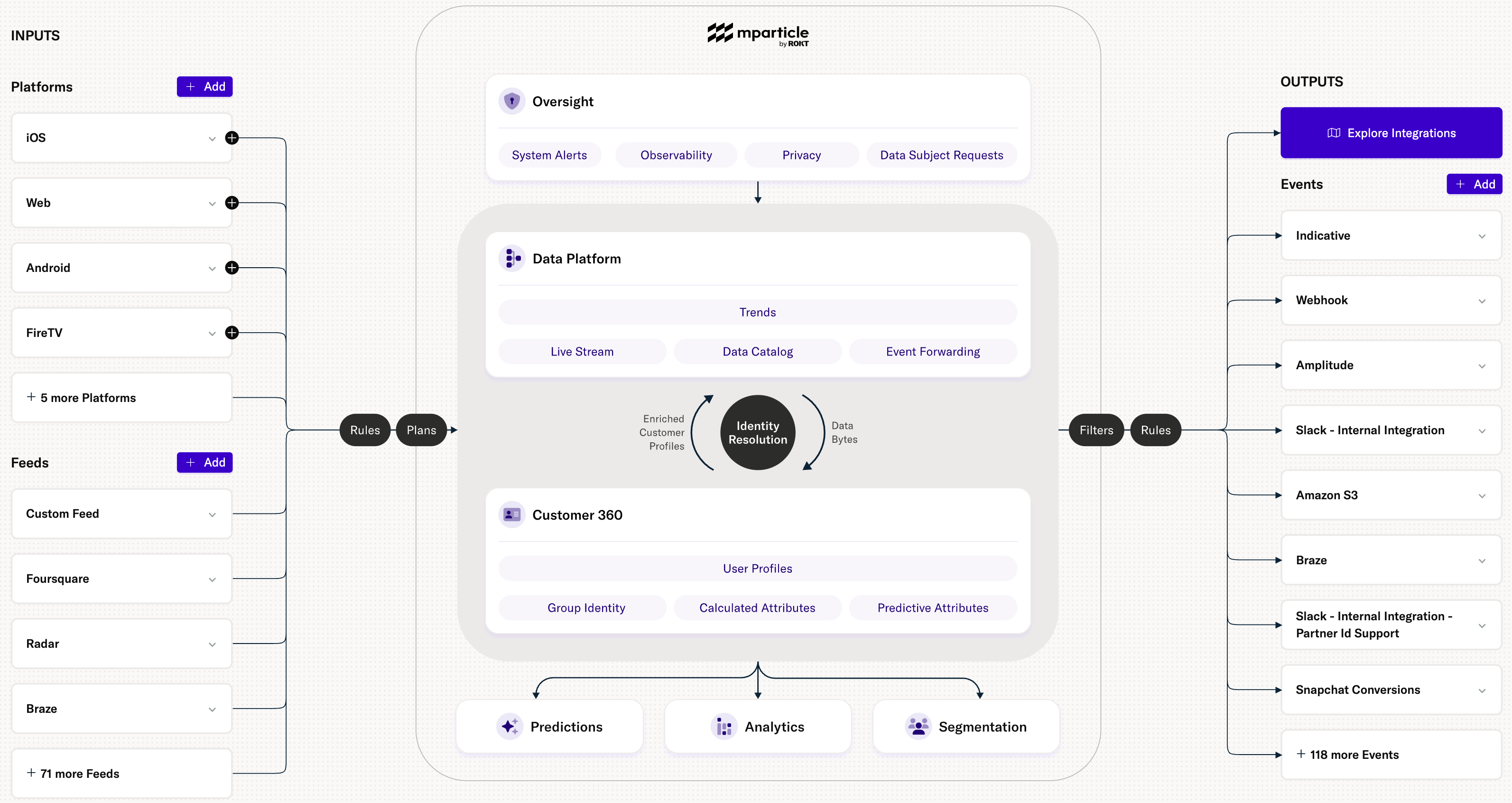
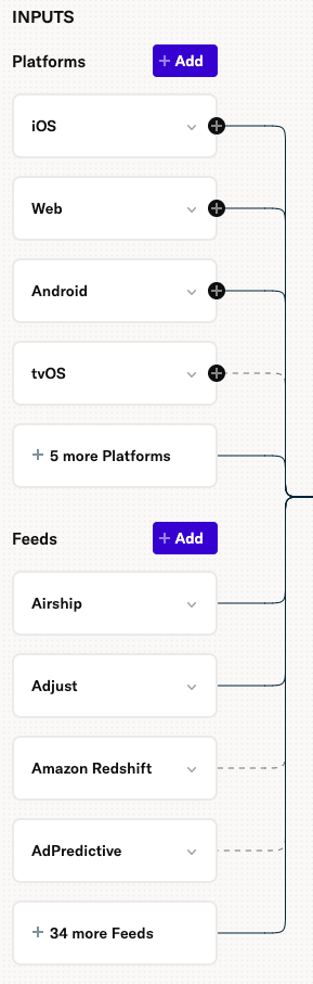
Inputs
Your data inputs include Platform inputs (such as iOS, Web, or Android) and Feed inputs (such as third-party marketing tools or data warehouses).
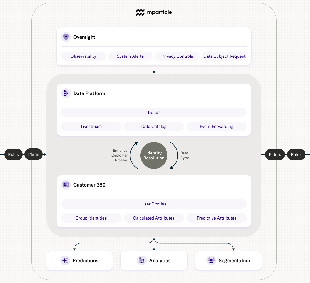
mParticle Suites
The mParticle Data Platform includes the different tools and features you use to manage, manipulate, and leverage your data before sending it to your outputs. These tools can be separated into several product suites:
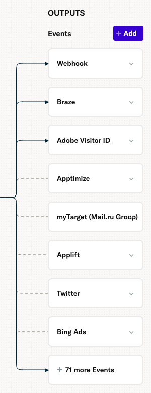
Outputs
The Overview Map displays all of your Event outputs, third-party marketing and data warehouse tools where you can forward your event data.
The navigation bar
In addition to the mParticle Overview Map, the new UI includes an updated left-hand navigation bar that makes it easier to navigate between specific features within each of the mParticle suites:
- Oversight: provides access to privacy settings in addition to observability tools like tracing and system alerts.
- Data Platform: contains the Setup menu where you can create inputs, outputs, and connections, along with tools like Data Plans and Live Stream.
- Customer 360: contains your user profiles, group identities, and calculated and predictive attributes.
- Analytics: provides access to mParticle’s analytics suite.
- Segmentation: contains the Journeys and Audiences user segmentation tools.
FAQ
We know it takes time to get comfortable with a new interface, but here are some common questions and answers:
Why can’t I access everything?
The overview map showcases how the entire platform works together. There might be some features that you can see in the overview map that you cannot see when you click into the feature. If you do not have access to a particular feature in the platform, you can request access from your admin.
Why are some of my inputs and outputs missing?
The overview map was created to show event flow. However, we have heard from customers that they want to see their entire data flow. We are working on an update to show additional Output categories, including Audiences.
Was this page helpful?
- Last Updated: April 16, 2026